If you’ve watched sport for any length of time you know that teams who keep a consistent lineup tend to win more games. Coaches talk about their strive to keep a core group on the park throughout the season in the pursuit of sporting glory. Some of them lament that they can’t because of injuries or the need to blood new players. Sometimes their plans are ruined by experienced players who grow tired of losing and find fortune elsewhere - or just simply retire.
I recently came across an analysis which seeks to quantify this association between team stability and performance. The analysis is no doubt designed to be a quick and simple approach. It correlates AFL teams’ current ladder positions with the number of players used by each team so far, by ranking them from the teams that used the most players to those who used the least. By doing this they find a correlation coefficient of 0.81 - a strong (and presumably statistically significant) correlation.
There are a few issues with this approach, although I don’t dispute the overall conclusion. The first issue is that it uses only part of a season, which may not paint a very useful picture. For example, some teams may have had a relatively easy draw so far. The other issue is that it has used ranked data which has several limitations. First, ranked data don’t account for the magnitude of differences between the teams. A good example of this is the current AFL ladder where Sydney is first, Brisbane is second and Fremantle is third. But when you look at the number of wins, Sydney is way in front with 56 premiership points while Brisbane and Fremantle both have 50. A distance of three ranks between these teams doesn’t tell the complete story here. The other issue is that using statistical tests designed for continous data with ranked data can reduce statistical power, leading to misleading results.
Analysis
One way to avoid these problems is to look at a team’s performance according to their number of wins across a whole season. One challenge in doing that is that we need to find complete seasons where teams have played the same number of games. Looking at recent seasons, we can’t use 2020 because that was the year that the AFL restricted the season to just 17 games instead of the more usual 22 to help deal with COVID-19. Next, 2023 is out because the season was extended to 23 games. And believe it or not we cannot use 2015 because an Adelaide coach was killed just before their clash against the Cats, leading to the cancellation of that game. So to get a sufficient and sensible sample, I’ve gathered data from the season 2016 to 2019 and 2021 to 2022. That’s 6 seasons for each of the 18 teams, which gives us 108 observations to work with.
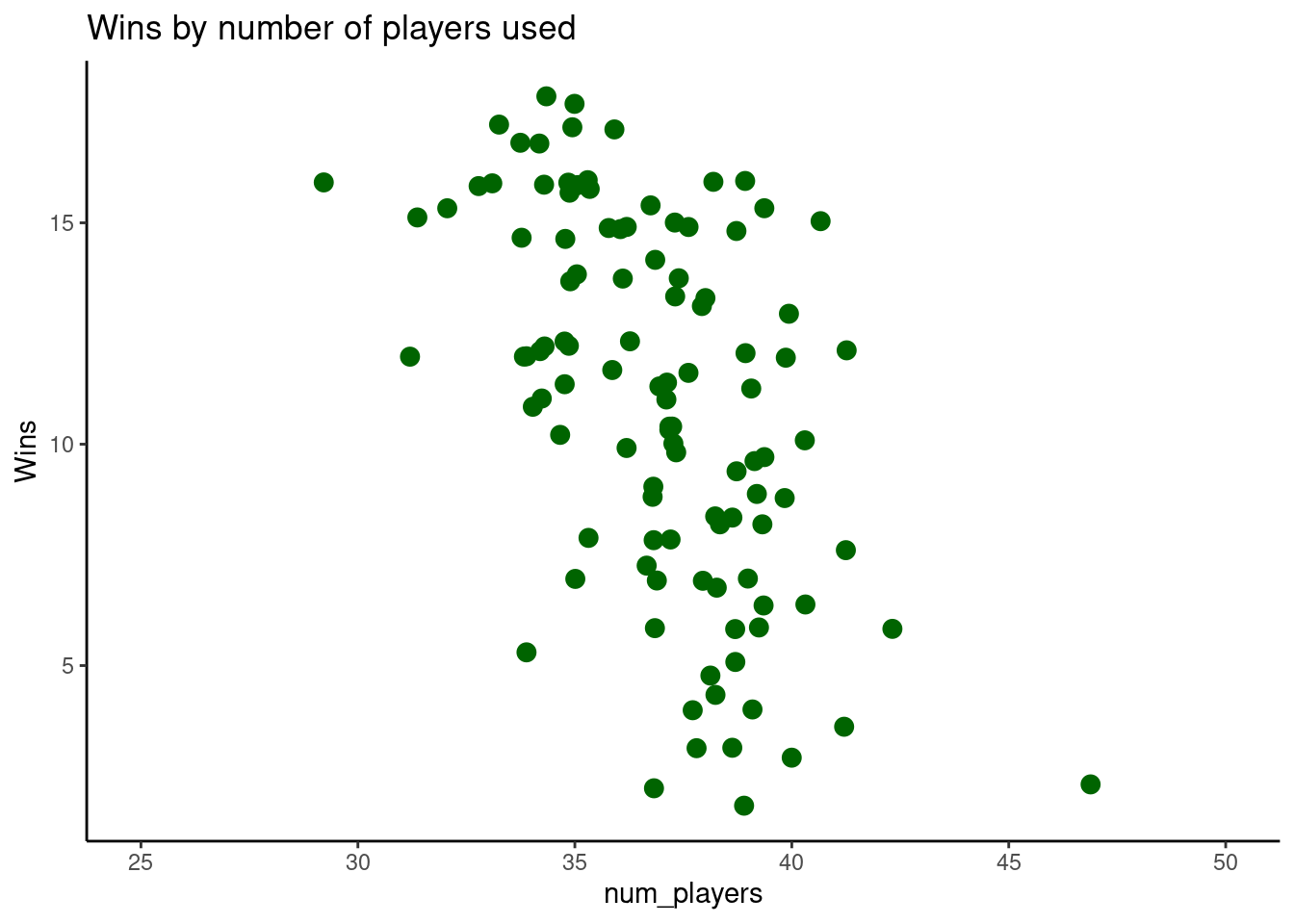
To get the most statistical power out of this data we can treat wins more appropriately as a count variable, rather than a rank or a continuous one. Plotting these wins for each team and eyeballing them gives us what looks like a negative correlation.
But as always it pays to do a proper analysis. Here I’m going with a generalised linear model which is suitable for the poisson distribution usually inherent in count variables this this one.
| Wins | |||
| Predictors | Incidence Rate Ratios | CI | p |
| (Intercept) | 212.77 | 94.89 – 474.68 | <0.001 |
| num players | 0.92 | 0.90 – 0.94 | <0.001 |
| Observations | 108 | ||
| R2 Nagelkerke | 0.452 | ||
The results in the table above confirm that there is a statistically significant and negative correlation between the number of players a team uses throughout the year and the number of wins they should expect to get.
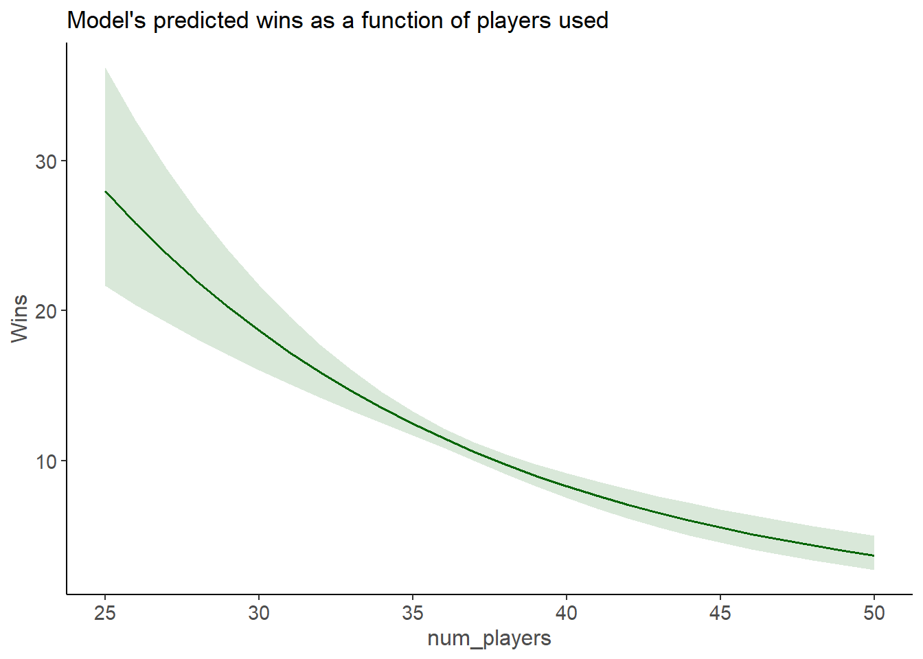
One of the downsides of using a generalised linear model is that the Incidence Rate Ratio coefficient numbers are pretty hard to interpret. So its customary to provide a plot of the marginal effects from the model, which usually provides a more complete picture than a simple coefficient anyway.

Here we can see that - generally speaking - teams that use 30 players during the season can expect to win about 16-21 games. While those that swap out the magnets 45 times tend to win just over five. But its also worth knowing that the relationship is curved, showing the exponentially greater wins for those teams that aren’t changing things around.
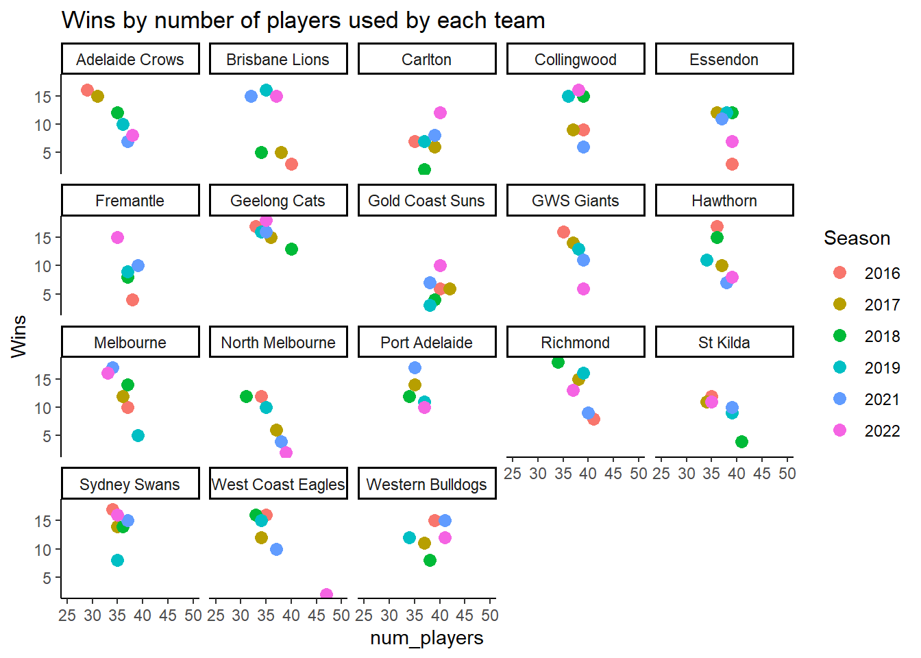
Of course this begs the question of how different teams have performed recently, now that we have some detailed insight on how this relationship works.

Here we can see some interesting things. My own team, Melbourne made quite a few changes in 2019 and by 2021 of course, they won a flag - a year where things were incredibly stable. The West Coast Eagles have slipped from a team that had quite a lot of success until 2022 when they performed badly and made plenty of changes. North Melbourne not had the luxury of stability and their performance progressively suffered.
Of course that’s not to say that simply turning over a team will have an effect. The causality runs in both directions. By that I mean that teams that are performing badly will try many new things to get back on track, and teams that have to play inexperienced players will likely take a performance hit - at least for a while.
Will the trend continue this year? We should wait until the end of the year for that, but it certainly seems to be.